Terra Translations
Word Wizards
Terra Translations does more than word-for-word translation. They see the whole story. This powerhouse woman-owned and minority-owned organization helps businesses unlock opportunities by tapping into a global audience. Terra partnered with Savage to show off their diverse capabilities and their colorful personality.
Scope
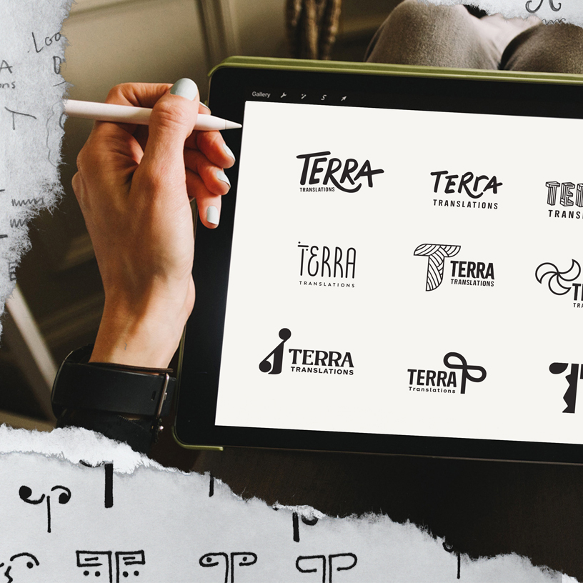
- Brand Architecture
- Brand Identity
- Website
The Client: Terra Translations
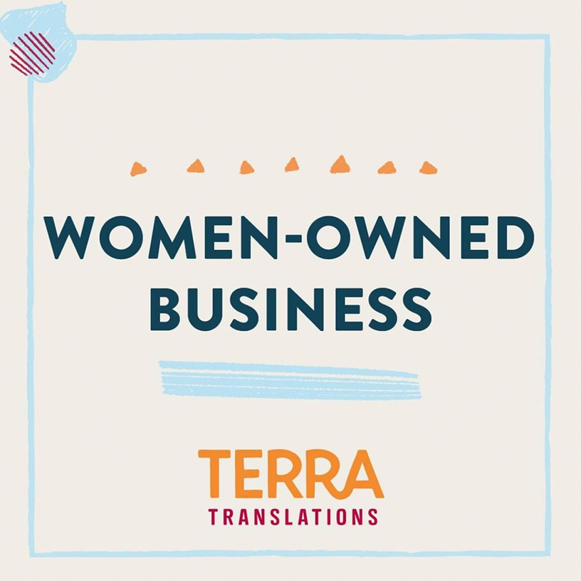
Terra Translations is a woman-owned (WBE), minority-owned (MBE) localization company who provides expert and tailored language services so companies can connect with a global audience. Their dynamic portfolio encompasses every major language, with a focus on all dialects of Spanish.
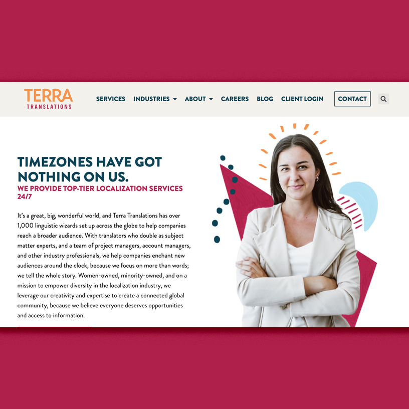
Time zones got nothin’ on Terra! Fully virtual, they’re able to team up with the brightest minds around the world and be there 24/7 for their clients. Drawing from a talent pool of over 1,000 expert linguists and a seasoned project management team, Terra is more than equipped to make magic happen!

The Challenge
Lost in Translation
The irony of working with a translation company, is the omnipresent risk of some of our work getting lost in translation. When building out Brand Architecture, for example, it was important to keep in mind that not everyone on Terra’s team is a native English speaker. While they are linguistic wizards often fluent in several languages, nuances and plays on words don’t always have the intended effect.
Another challenge concerned the aesthetic. In researching other translation and localization companies, we noticed they’re quite…corporate-y. The key was going to be separating Terra from the *yawn* competition, yet still communicating professionalism.
The Strategy
The Universal Language of Design
Terra is a fun, energetic company made up of fun, energetic people. While they translate with absolute precision and localize content to ensure cultural appropriateness, the Terra team also brings the “human touch” often missing from their industry.
We worked a hint of magic into their messaging (inspired by Terra’s organic use of “wizards” and “unicorn clients”), keeping it relatively simple so as not to exclude readers. Instead, we decided to put the heavy lifting on a more universal language: the visual elements.
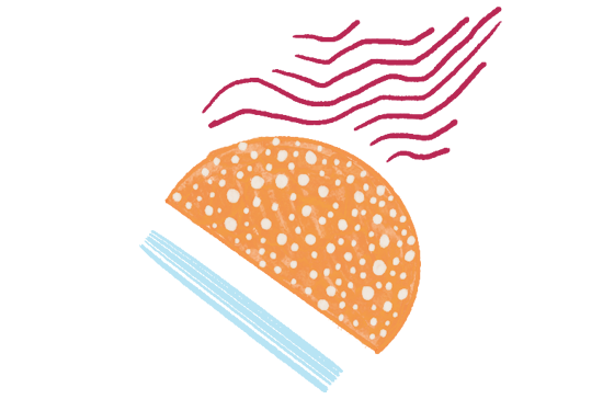
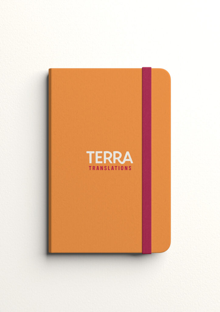
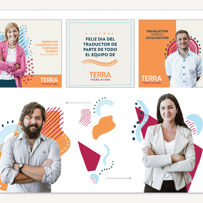
When it came to building the Brand Identity, Savage created “hand-drawn” abstract shapes to exude the Terra team’s cheery and upbeat personality. And, since they loved their existing color palette of bright swatches, we simply enhanced it. These visual elements all work together, mimicking Terra’s capabilities, collaboration, and expertise.
RESULTS

The Result
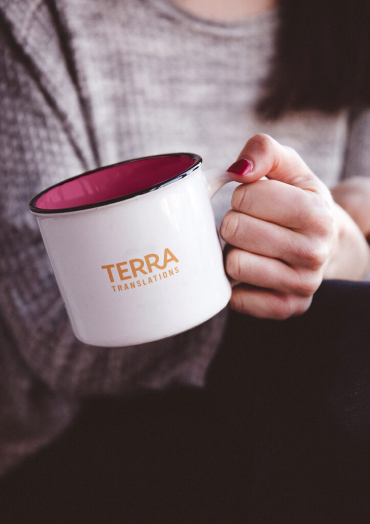
Terra’s new brand is exciting, fresh, and approachable. Most importantly, their messaging and website communicates their capabilities and expertise to companies looking to reach a global audience.
The Terra team has fully embraced their vibrant brand and integrates it in all that they do: from internal communications to their business cards, emails, blog posts, and more. Most importantly, they can attract more ideal clients by virtue of the quality, engaging, and collaborative experience they provide.

SoulBoxer Cocktail Co.
Gotta Read It